The Real (Ugly) Portrait of Republican Red-State America
HERE’S THE REAL PICTURE OF RED-STATE AMERICA — AND IT SHOULD SCARE REPUBLICANS
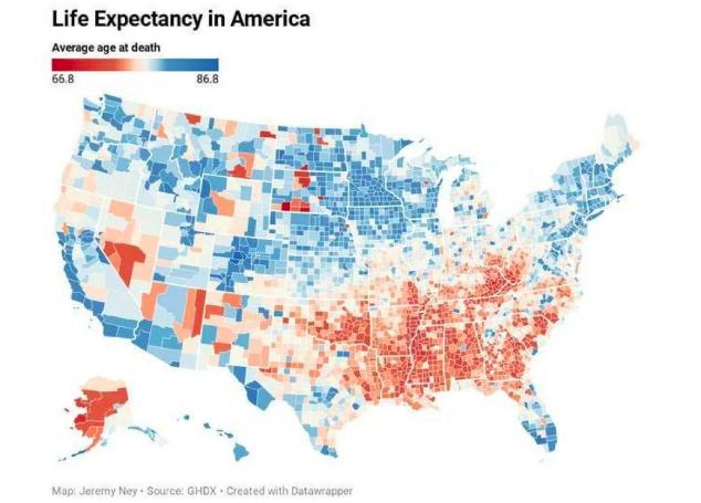
See all that red?
That’s the lowest end of the spectrum on *life expectancy* in America.
See all that blue?
That’s the highest end of the spectrum on *life expectancy* in America.
Still believe the myth that living conditions in conservative Republican-dominated RED counties and states are better than living conditions in more liberal Democratic BLUE counties states? The longevity gap between the lowest and highest states overall is 8 years. The longevity gap between the lowest and highest county is 20 years! That’s an astonishing indictment–reminiscent of the divide between first world and third world nations.
But this is America.
Slashing government funding and easy access to health care is devastating. Cutting social programs designed to help low-income people is devastating. Gutting regulations intended to protect workers and consumers is devastating. Eliminating pollution standards such as the basic human right to clean air and water is devastating. Small government might sound good in a political campaign, but the real consequences on a society are devastating.
And this map proves it. Vote REPUBLICAN RED, die faster. Vote DEMOCRATIC BLUE, live longer. The facts are the facts.